Have you ever wondered how comic book pages get made? Well, there’s about a million different ways artists go about it, but I decided to share a quick post showing how I do it. I hope you enjoy seeing what goes into each page of Salvage Hounds!
Check out the gallery for a guided tour of my process, where you can click each image for more info about that step.
And remember, Salvage Hounds is available now as a digital PDF in the shop!
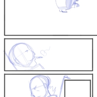
Storyboard Stage. Each page starts as a very basic layout. At this stage, it’s all about figuring out the flow of the panels, as well as a few rough, gestural scribbles to indicate what I intend for each panel. Note that I went back and added a 3D render of the space hopper pod before moving on to the pencil stage.
Storyboard Stage. Each page starts as a very basic layout. At this stage, it’s all about figuring out the flow of the panels, as well as a few rough, gestural scribbles to indicate what I intend for each panel. Note that I went back and added a 3D render of the space hopper pod before moving on to the pencil stage.
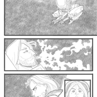
Pencils Stage. This is all about taking the rough layout and putting in actual drawings. It’s at this stage that I really figure out how the roughs are going to translate into final images. There can be a lot of changes to the original if I think of something that feels better. The legs and arms of the space hopper are draw in, using the body render as a guide.
Pencils Stage. This is all about taking the rough layout and putting in actual drawings. It’s at this stage that I really figure out how the roughs are going to translate into final images. There can be a lot of changes to the original if I think of something that feels better. The legs and arms of the space hopper are draw in, using the body render as a guide.
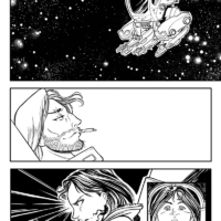
Ink Stage. Inking over the pencils actually gets the page about half way done. At this stage, I’m trying to use the inks to define light, shade, and form, but I have to keep in mind that more shading is coming with the grays. Still, my aim here is to make the page stand on its own in stark black and white.
Ink Stage. Inking over the pencils actually gets the page about half way done. At this stage, I’m trying to use the inks to define light, shade, and form, but I have to keep in mind that more shading is coming with the grays. Still, my aim here is to make the page stand on its own in stark black and white.
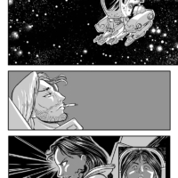
Flat Gray Stage. I lay in base tones for the grays, using white to define the brightest tone. At this stage, the page has a sort of old-school manga/zip-tone look. In the past I would have probably stopped here (maybe after adding some additional gradients), but for this book I decided to push my style in a new direction.
Flat Gray Stage. I lay in base tones for the grays, using white to define the brightest tone. At this stage, the page has a sort of old-school manga/zip-tone look. In the past I would have probably stopped here (maybe after adding some additional gradients), but for this book I decided to push my style in a new direction.
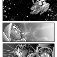
Gray Painting Stage. For this stage I use the original gray layers as selection masks and paint shading into them. For example, each area of skin, hair, background, costume, etc is a separate layer that can be selected and painted into without disturbing the other layers.
Gray Painting Stage. For this stage I use the original gray layers as selection masks and paint shading into them. For example, each area of skin, hair, background, costume, etc is a separate layer that can be selected and painted into without disturbing the other layers.
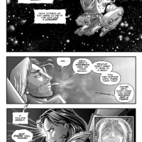
Final Page. A few extras are added, including some speed line effects, the reflections on the space hopper canopy and space suit visor, and some additional light effects and glows to add a soft light to the top and middle panel. Finally, the letters are dropped in to complete the page.
Final Page. A few extras are added, including some speed line effects, the reflections on the space hopper canopy and space suit visor, and some additional light effects and glows to add a soft light to the top and middle panel. Finally, the letters are dropped in to complete the page.
And, in case you missed it, here’s a video over on the You Tube channel that shows some of the techniques I used to create the cover illustration.

