This gallery contains both traditional and digital inks, from ink sketches to detailed illustrations. Tap any image to enlarge, and then tap again for more info.
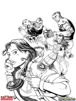
Salvage Hounds V2 Cover Inks
For the cover to Salvage Hounds Volume 02, I wanted to go for a more traditional illustration look. To achieve that, I started with the inking style from the interior of the book, but spent a bit more time on details, textures, and blacks, but left plenty of room for paint.
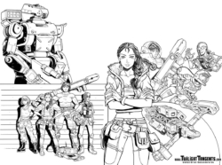
Salvage Hounds 01 Wrap Around Cover Inks
I've been pushing myself to use more blacks and shadows in my inks, especially on this book. However, knowing that the background was going to be a black, starry space sky made me hold off on putting too many shadows in the foreground.
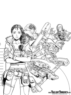
Salvage Hounds 01 Front Cover Inks
Cover inks are never really intended to stand on their own. After all, things like the planet are going to be painted, so leaving space for that to come later means picking and choosing where to spend time on line details.
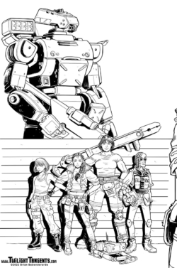
Salvage Hounds 01 Back Cover Inks
I ended up using more black shadows on the mechanical elements, such as the ship and mecha. The aim was to give them a little more weight as background elements and let the characters pop out a little more—almost like separating character cels from an animation background.
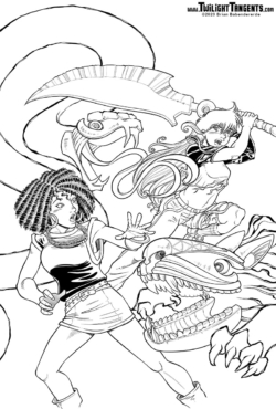
Curse of the Feral Gods Cover Inks
Inking the covers is fun. Rather than treat it as just another panel, I try to up my game and treat it as a mini-illustration. However, you can see that I left a lot of areas blank, knowing full well that paint and color would fill in the details.
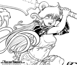
Curse of the Feral Gods Cover Inks Details
Just a little zoomed in shot to give you some idea of how much detail I try to fit into the covers.
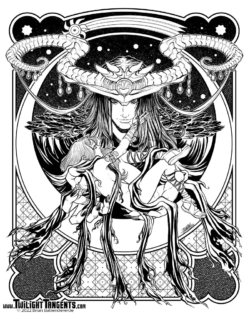
Prince of Demons Pen & Inks
I created this inked version of Prince of Demons on a whim—I had already inked the lines in preparation for a full painted version. But, I figured I was already half way to a finished pen and ink piece, so why stop?
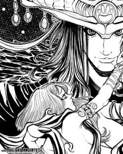
Prince of Demons Pen & Inks (detail)
I used this piece as an opportunity to learn some new techniques, including the fading cross hatching in the starry sky.
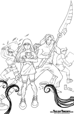
Slumber Party of DOOM! Cover Inks
Inking the covers is always a nice change of pace from doing interior panels. I treat these more like full illustrations and add as much detail as I can. However, since the image is going to be painted, I leave off just about all the shading and shadowing and keep it fairly "flat" at this stage.
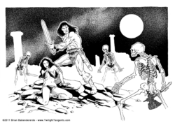
The Witching Hour (Ink) - 2011
The Witching Hour was the first of the two Conan inspired pen and inks that I did in early 2011 after reading quite a few reprints of The Savage Sword of Conan comics from the 1970s. Like the companion piece, this one was penciled and inked on paper with traditional pen and inks, then scanned in and touched up with digital inks in Painter. Most of the touch ups were in the details, such as the cloth textures and the stars.
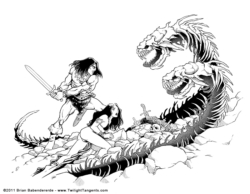
Savage Sword (Ink) - 2011
This was the result of re-reading a bunch of the old Savage Sword of Conan reprints. For this piece, I started with traditional pens and India ink and completed a finished ink. I'm glad I did, because it re-educated me on what I was missing out on with microns and markers. There is just something classic to a traditional quill pen line.
However, I scanned the results and used that as a basis to dabble with digital inks in Painter. This process allowed me to get back up to speed on using my pens, but allowed me to still experiment with cross hatching styles for the finer details.
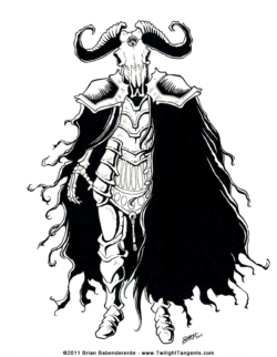
Death Knight (Ink) - 2011
This was the result of playing Dark Souls for several weeks and wanting to do something in that style...
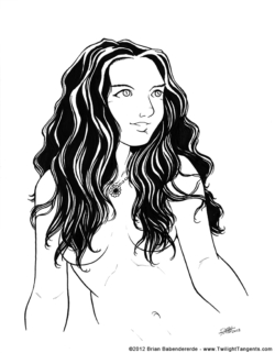
Brushed Hair (Ink) - 2012
On this sketch I experimented with using a brush for the hair. A brush is great for things that are "flowing," and now I like to messing around with different size brushes for most of my inking.
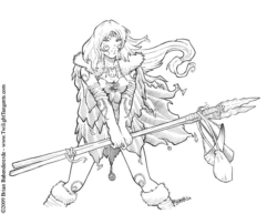
Snow Hunter - 2009
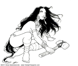
This was a cavegirl sketch I liked quite a bit, and used it to experiment with using microns for inking.
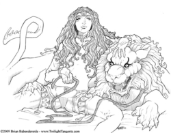
Martian Guard Dog - 2009
For this one I wanted to experiment with hair textures and creating light surface shadows on the skin and fabric. At this point, I felt more comfortable using the inks to create textures than I do rendering shadows and light.
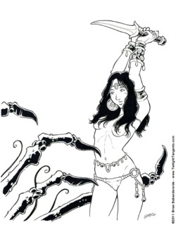
Savage Knife (Ink) - 2011
Another ink experiment that turned into something I quite like. I almost called it: "Crabs!"
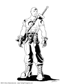
Swordsman - 2012
This was an old character design for a game. It didn't end up being used, so I just spruced it up with some ink for fun.
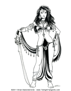
Pirate Queen of Mars (Ink) - 2012
This was just a sketch messing around with costume design for martian princesses. After adding the sword, I felt it had taken on a decidedly "Pirate" nature.
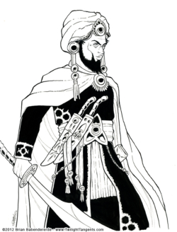
Desert Warrior - 2012
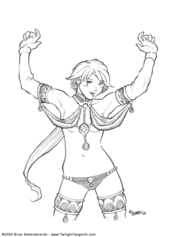
This was me just fooling around with my pens. I wanted to do something a little different me, and experiment with some an Arabian nights style costume.
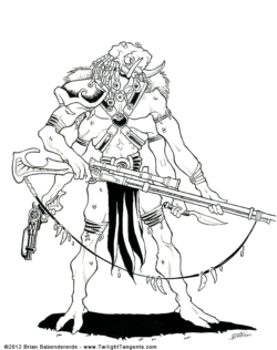
Tars Tarkas Jeddak of Thark - 2012
One of my takes on a design for the green men of mars, from Edgar Rice Burroughs's John Carter of Mars series.
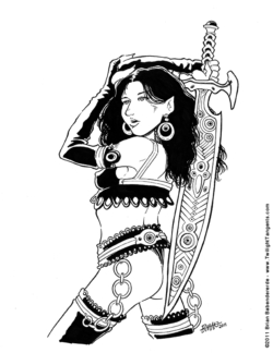
Leather Elf - 2011
For this ink sketch I wanted to use black to have fun with her outfit. I later took the pose and turned into something a bit different.
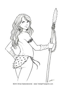
Cheeky Spear - 2012
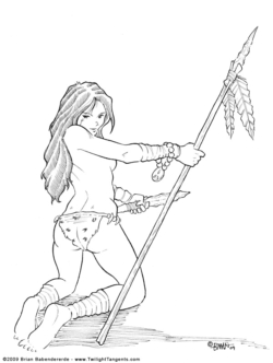
This was me messing around with finding a style for rendering blonde hair in ink that I like. This was a good step forward, but I'm always still experimenting.
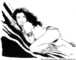
Silken Princess (Ink) - 2011
One of my figure drawings that I decided to turn into something more by adding costume and a simple background.
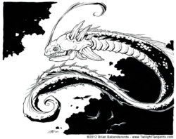
Sky Fish - 2012
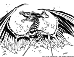
This was just me having fun with drawing a creature, and experimenting with how to ink the scales.
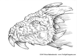
Dragon Head - 2007
This was originally a sketch I did for Capricon 07. Later, I had some free time at a con, so I got out the inks and finished it off.
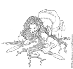
Savage! (Ink) - 2009
I like the way this experiment with microns turned out - the composition and the ink textures were fun to do. I think its because the overall effect is striking, while staying simple and clean.

